To really improve your website's conversion rates, you first need to know where you stand. This means getting a firm grip on your data to create a clear baseline. It’s all about defining what a 'conversion' actually means for your business, setting up analytics to track what your visitors are doing, and seeing how your performance stacks up against UK industry benchmarks.
This isn’t about guesswork; it's about turning vague ideas into a measurable strategy.
Establishing Your Baseline For Better Conversions
Before you start tweaking buttons and rewriting headlines, you need a clear starting line. Without understanding your current performance, it’s impossible to know if any of your optimisation efforts are actually working. Think of it less as staring at numbers and more as learning the story your data is telling you about your visitors.
A "conversion" is simply any valuable action a visitor takes on your site. For an e-commerce store, the ultimate goal—the macro-conversion—is a completed purchase. Simple enough. But don't overlook the smaller steps along the way. These are your micro-conversions, and they're just as important to track.
These smaller actions show that a visitor is engaged and moving through your sales funnel. Good examples include:
- Signing up for your company newsletter.
- Downloading a free guide or white paper.
- Adding a product to their shopping basket.
- Watching a promotional video about your service.
Tracking these helps you pinpoint exactly where potential customers are dropping off and which parts of their journey are performing well.
Setting Up Your Analytics Foundation
To measure any of this, you need a solid analytics platform. While Google Analytics has been the go-to for years, it's vital to make sure it's configured properly to track the specific goals that matter to your business. This often means setting up event tracking for button clicks, form submissions, and other key interactions that define a micro-conversion.
For businesses wanting to dig a bit deeper, it's worth exploring other tools. If you're weighing up your options, our guide on Google Analytics alternatives provides a solid overview of different platforms that might be a better fit for your needs.
Understanding UK Conversion Benchmarks
Knowing your own numbers is one thing, but context is everything. You need to know how you compare to others in your field. This is where industry benchmarks come in.
Below is a quick look at average conversion rates across different UK e-commerce sectors. This will help you set realistic goals and understand what's achievable in your market.
UK E-commerce Conversion Rate Benchmarks by Sector
| E-commerce Sector | Average Conversion Rate (%) |
|---|---|
| Fashion & Apparel | 5.2% |
| Health & Beauty | 4.8% |
| Home & Garden | 3.9% |
| Electronics | 3.1% |
| Groceries | 11.1% |
As you can see, the numbers vary wildly. Groceries, a high-intent, repeat-purchase sector, performs exceptionally well, while others sit much lower. Use this data to ground your expectations and focus on improving your own baseline.
Setting realistic goals is paramount. Comparing your niche boutique's conversion rate to a major supermarket's is counterproductive. Instead, use industry data as a directional guide and focus on achieving incremental improvements from your own starting point.
This chart paints a clearer picture of how much conversion rates can differ across major UK retail sectors.
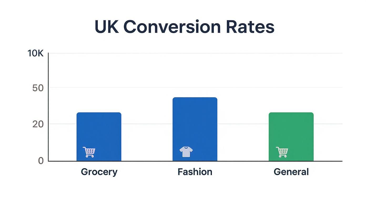
The data makes it obvious: high-intent sectors like groceries convert far more effectively than general retail, which really drives home the importance of sector-specific analysis. By defining your key metrics and understanding the relevant benchmarks, you're building a solid foundation for any successful conversion rate optimisation strategy.
Boosting Your Site Speed And Mobile Experience
In the race for conversions, speed is everything. A slow or clunky website, especially on a mobile phone, is one of the quickest ways to lose a potential customer. Every single second your site takes to load is another chance for a visitor to get impatient and click away—and take their business with them.
The impact isn't trivial; it's a direct hit to your bottom line. Research has found a clear link between how fast a page loads and its conversion rate in the UK retail sector. For instance, a page that loads in 2.4 seconds might see a conversion rate of around 1.9%. Let that slip to 4.2 seconds, and you could see that rate plummet to below 1%. The data confirms what we all know from experience: patience is in short supply online. You can dig into the full findings on how page speed affects e-commerce conversions.
Fixing this isn't just a job for developers; it's a core part of any smart strategy to improve website conversion rates.
Optimising Your Technical Performance
Making your site feel faster often comes down to a series of small, targeted improvements that, together, make a massive difference. These technical fixes are the foundation of a good user experience and a key part of what makes up a solid technical SEO strategy.
The good news is you don't need to be a coding wizard to get the basics right. If you want to dive deeper, our detailed article on what is technical SEO is a great place to start.
Here are three areas you can focus on right away:
-
Compress Your Images: Large, unoptimised image files are usually the biggest culprits behind a slow website. Before you upload them, use a compression tool to shrink their file size without any noticeable drop in quality. This one step alone can dramatically slash load times.
-
Leverage Browser Caching: Caching is a clever way for a visitor's browser to 'remember' parts of your site, like your logo and footer. So, when they visit a second page, the browser doesn't have to reload everything from scratch. It makes every subsequent page load feel almost instant, creating a much smoother journey.
-
Minify Your Code: Your website's code—the CSS, JavaScript, and HTML—can be cluttered with unnecessary characters, spaces, and comments left over from development. Minification tools strip all that out, making the files smaller and quicker for browsers to read. Think of it as a simple clean-up that pays off big in performance.
A quick-loading site is a great start, but how does it actually perform on the devices people use most?
Mastering The Mobile-First Experience
With most of your UK traffic likely coming from mobile devices, a simple responsive design just doesn't cut it anymore. Your website needs to be built with the mobile user in mind from the ground up. This isn't just about making things functional on a small screen; it's about making the entire experience genuinely effortless.
A mobile-first approach isn't about making your desktop site fit on a phone. It's about designing for the constraints and behaviours of mobile users first—simplicity, speed, and ease of use—and then scaling up for larger screens.
Here are a few practical steps you can take to create a superior mobile experience:
- Simplify Navigation: Ditch the complex menus for a clean, simple "hamburger" icon. Make sure your most important pages are no more than one or two taps away.
- Create Thumb-Friendly Buttons: Ensure your calls-to-action and other buttons are large enough, with enough space around them, to be easily tapped with a thumb. This prevents those frustrating mis-clicks that drive users crazy.
- Keep Forms Short: Nobody enjoys filling out long forms, especially on a mobile. Be ruthless. Cut every single non-essential field. If you have a longer process like a checkout, break it down into multiple, manageable steps to stop people from feeling overwhelmed.
By addressing both the raw speed of your site and the specific needs of your mobile audience, you remove the biggest friction points that stop visitors dead in their tracks.
Designing A Seamless On-Site User Journey
A brilliant user experience (UX) is the engine that powers high conversion rates. It’s not about flashy design; it’s about making your website so intuitive that visitors can achieve their goals without a second thought. To really boost your website's conversion rates, you need to get inside your user's head and perfect the entire journey they take, from the moment they land on your site to that final, satisfying click.
Think of your website like a physical shop. If the aisles are cluttered, the signs are confusing, and the checkout queue is a mile long, customers are just going to leave. Your website is no different. A confusing layout or a complicated process creates friction, and friction is the ultimate conversion killer.

The goal here is to create an effortless path that gently guides visitors towards your call-to-action. You want the decision to convert to feel natural and easy. This whole process kicks off with understanding how people actually see and interact with your pages.
Guide Attention With Visual Hierarchy
Visual hierarchy is the art of arranging elements on a page to show their order of importance. It’s about using simple principles like size, colour, and placement to draw the user's eye towards the most critical information, creating a clear, scannable path for them to follow.
When someone lands on your page, their eyes naturally follow a pattern. By placing your most important message—your unique value proposition—and your main call-to-action along this natural viewing path, you make sure they can't be missed. This isn't about manipulation; it's just clear communication.
Here are a few practical ways to get this right:
- Size Matters: Your main headline should be the largest text on the page, followed by subheadings, and then your body text. It’s a simple trick that instantly tells the user what the page is about.
- Use Colour Strategically: Your primary call-to-action button needs to pop. Use a contrasting, yet complementary, colour that makes it stand out from the background. It should be the most eye-catching interactive element on the screen.
- Leverage White Space: Don't cram every inch of the page with content. Giving key elements, like a "Buy Now" button, plenty of white space around them makes them stand out and gives them room to breathe.
This structured approach stops visitors from feeling overwhelmed and helps them process information quickly, making them much more likely to take that next step.
Simplify Your Website Navigation
Your website's navigation is its road map. If it’s complicated, visitors will get lost and frustrated. And frustrated visitors don't convert; they bounce. In fact, difficult navigation is one of the top reasons people ditch a website.
The key to great navigation is simplicity and clarity. A user should be able to find what they need in three clicks or fewer. If they have to think too hard about where to go next, you've already failed them.
A seamless user journey feels invisible. The visitor doesn't notice the navigation or the layout; they just feel like the website understands exactly what they're looking for and provides it effortlessly.
This focus on a frictionless experience is also crucial for just keeping visitors on your site in the first place. For a deeper look into this, our guide on how to reduce bounce rate offers extra strategies for keeping users engaged.
Streamline Your Forms and Checkout
Forms are often the final hurdle between a visitor and a conversion. Whether it's a contact form, a sign-up page, or a checkout process, this is where so many potential customers give up. Data consistently shows that the average shopping basket abandonment rate is nearly 70%, and a long or complicated checkout is a huge reason why.
Your mission is to make this final step as painless as possible. Every single field you ask a user to fill in adds friction. You need to be ruthless.
Quick Wins for Form Optimisation:
- Cut Unnecessary Fields: Do you really need their phone number for a newsletter sign-up? Probably not. Get rid of every field that isn't absolutely essential.
- Offer Social Logins: Letting users sign up or log in with Google or Facebook is a game-changer. It saves them from creating yet another password and fills in their details automatically.
- Use Clear Error Messages: If a user makes a mistake, don't just flash a generic "error" message. Clearly highlight which field is wrong and explain how to fix it (e.g., "Please enter a valid postcode").
- Show Progress: For multi-step processes like checkout, a simple progress bar showing users where they are and how many steps are left can work wonders. It manages expectations and reduces anxiety.
By designing a journey that is clear, simple, and respectful of your user's time, you remove the barriers that stop them from taking action. An effortless experience doesn't just feel better for them—it directly translates into higher conversion rates for your business.
Crafting Copy And Calls-To-Action That Convert
Your words are your most powerful sales tool. While a beautiful design and fast-loading pages get visitors in the door, it’s your copy and calls-to-action (CTAs) that persuade them to stay, engage, and ultimately convert. Getting this right is about far more than just stringing a few sentences together; it’s about connecting with your UK audience on a psychological level.
Excellent copy makes it immediately obvious why a visitor should choose you over a competitor. This starts with a clear, compelling value proposition placed front and centre. It needs to answer the visitor's unspoken question—"What's in it for me?"—within seconds of them landing on your page.

This isn’t the place for vague jargon or corporate fluff. It’s all about benefits, not features. A user doesn't care about your "synergistic software solution"; they care that it will save them £200 a month in admin costs. That’s the kind of direct, benefit-driven language that drives action.
Writing A Value Proposition That Connects
Your value proposition is a short, sharp statement that defines the unique value you offer. Think of it as the core of your messaging and the foundation for improving your website conversion rates.
To craft one that actually works, focus on three key elements:
- Relevancy: Clearly explain how your product or service solves your customer's specific problem.
- Quantifiable Value: Highlight the specific benefits they will receive. Can you promise saved time, increased revenue, or reduced stress?
- Differentiation: Make it crystal clear why they should buy from you and not from the competition. What makes you the best choice?
This clear messaging should then be carried through all your copy, from headlines to product descriptions, ensuring a consistent and persuasive narrative across the entire user journey.
The Psychology Of A High-Performing Call-To-Action
Your CTA is the final instruction you give your visitor. A bland, passive button like "Submit" or "Click Here" is a totally wasted opportunity. The most effective CTAs are specific, urgent, and action-oriented, creating a clear picture of what will happen next.
A great call-to-action doesn't just tell a user what to do; it makes them want to do it. It bridges the gap between passive browsing and active engagement by framing the next step as a valuable outcome for them.
Think about the difference in language. "Submit" feels like a chore, something you’re giving up. In contrast, "Get My Free Quote Now" is empowering. It’s personal, immediate, and focuses entirely on the benefit to the user.
Here’s the anatomy of a truly compelling CTA:
- Start with a Verb: Use strong, action-focused words like "Get," "Reserve," "Download," or "Claim."
- Be Specific: Instead of "Learn More," try "Download Your Free E-book." This tells the user exactly what they're getting.
- Add Urgency or Scarcity: Phrases like "Limited Time Offer" or "Only 3 Left in Stock" can be incredibly effective. Consider the psychological impact of urgency; for example, successfully adding a countdown timer to your website to boost urgency and sales can significantly increase conversion rates.
- Make it Stand Out: The button's design is just as important as the words on it. Use a contrasting colour that draws the eye and ensure it’s large enough to be easily clickable, especially on mobile devices.
Testing And Refining Your Message
Writing brilliant copy and CTAs isn't a one-off task; it's an ongoing process of refinement. What resonates with one audience segment might fall flat with another, which is where A/B testing becomes your best friend.
Don't be afraid to experiment. Test different headlines, value propositions, button colours, and CTA text. You might be surprised by what works. I’ve seen a simple change from "Your Free Trial" to "My Free Trial" lead to a noticeable uplift in clicks, purely because it gives the user a sense of ownership.
By combining a clear value proposition with psychologically-driven CTAs, you turn your website from a passive brochure into an active sales tool. Every word should work hard to guide the visitor, build trust, and make the decision to convert feel like the most natural next step.
Analysing Traffic Sources To Find Quality Visitors
It's easy to get excited about rising website visitor numbers, but let's be honest: not all traffic is created equal. A flood of low-quality visitors won't do much for your conversion rates. The real gold is in understanding where your best visitors—the ones who actually buy, sign up, or enquire—are coming from.
This isn't just about tweaking your marketing budget. It's about focusing your energy where it delivers the biggest impact. Someone clicking through from a targeted email newsletter has a completely different mindset to a person who stumbles onto your site from a random social media post. Knowing which channels bring in engaged, high-intent users lets you double down on what’s working and cut back on what’s not.

The first step is to dive into your analytics. You need to segment your traffic by its source. Look at how visitors from organic search, paid ads, email campaigns, and social media behave. Which group sticks around the longest? Who has the lowest bounce rate? Most importantly, which channel delivers the highest conversion rate?
Aligning Your Message With Visitor Intent
Once you've spotted a high-performing channel, the next job is to make the journey from that source to your website completely seamless. This is often called message matching, and it’s all about consistency. The ad, email, or post a visitor clicks on creates an expectation, and your landing page must deliver on that promise instantly.
Imagine a user clicks a paid ad promoting a "50% Off Spring Sale on Garden Furniture." If they land on your generic homepage instead of a page dedicated to that exact sale, you've created a jarring disconnect. The user is forced to hunt for what they were promised, and let's face it, most won't bother. They'll just leave.
To get this right, you need to build a consistent journey that builds trust from the very first click.
- Paid Ads: Make sure your landing page headline and main image directly reflect the ad copy.
- Email Marketing: Link to a page that continues the story from your email, using the same tone and visuals.
- Social Media: Promoting a specific product? The link should go directly to that product page, not a general category.
A consistent message reassures visitors they've come to the right place. This simple act of meeting expectations reduces friction and significantly increases the likelihood of a conversion. It's about making the user's decision to click feel validated.
Prioritising Your Highest-Converting Channels
Data from the UK e-commerce landscape shows a clear pecking order for how different traffic sources perform. It turns out that email marketing and referral traffic are the heavy hitters, achieving average conversion rates of 5% to 5.4%. That’s substantially higher than organic search, which sits around 2.1%. Paid ads and social media lag further behind at 1.4% and 0.7% respectively. You can find more e-commerce conversion benchmarks on clevertap.com.
This data gives you a clear road map. If email marketing is a top performer, it’s time to pour some love into that channel. You could segment your list for more personalised campaigns, run exclusive offers for subscribers, or improve your welcome series to engage new sign-ups right away.
Likewise, if you're getting great results from referral traffic, it means your brand advocates are doing fantastic work. Why not amplify this by creating a formal referral programme that rewards customers for spreading the word?
By methodically analysing where your best customers originate and optimising their specific journeys, you shift from simply attracting traffic to attracting the right traffic. This targeted approach is a cornerstone of any successful conversion rate optimisation strategy.
Building A Culture Of Continuous Optimisation
Getting your conversion rate where you want it isn't a one-and-done job; it’s something you have to keep working on. To really nail it, you need to weave a mindset of continuous improvement right into your company’s DNA. This means ditching the guesswork and gut feelings and, instead, making decisions backed by hard data and consistent experimentation.
When you take this approach, conversion rate optimisation stops being a project with an end date and becomes a constant cycle of learning and tweaking. By testing, analysing, and iterating over and over, you make sure your website keeps up with your customers' needs and behaviours. It’s how you build a system that consistently finds what works for your audience and drives long-term growth.
Embracing A/B Testing And Experimentation
At the heart of continuous optimisation is A/B testing, sometimes called split testing. It’s pretty straightforward: you create two versions of a webpage—a control (Version A) and a variation (Version B)—and show them to different segments of your audience to see which one performs better.
You can test almost anything, but it’s smart to start with the elements that directly influence conversions. Think about things like:
- Headlines: Does a headline focused on benefits get more attention than one phrased as a question?
- CTA Buttons: Does "Get Your Free Plan" convert better than "Sign Up Now"?
- Images: Will a clean product shot outperform a lifestyle photo with a person in it?
- Form Length: Does chopping one field off a form lead to more submissions?
The trick is to change only one thing at a time. This way, you can confidently attribute any performance shift to that specific change, giving you clean, actionable results. If you're looking for more practical ideas, you can explore these essential Conversion Rate Optimization best practices to get a head start.
Every good A/B test starts with a solid hypothesis. For example: "Changing the CTA button colour from blue to orange will increase clicks by 15% because the higher contrast will draw more attention." This gives your experiment a clear purpose and tells you what success looks like.
For those times when you want to test several changes at once—like a new headline, image, and CTA all together—multivariate testing is your best bet. This method lets you see how different combinations of elements work together, helping you find that winning formula a lot faster.
From Hypothesis To Actionable Insights
Running a successful test is more than just launching a new version of a page. You need a structured process to make sure your results are reliable and lead to real improvements. A solid testing cycle always involves forming a data-backed hypothesis, running a clean experiment, and then using the results to decide your next move.
This iterative loop ensures your decisions are grounded in actual user behaviour, not just assumptions. With every test, you'll build up a rich repository of knowledge about what makes your audience tick. This data is gold for tracking progress, which is why having a clear system for documenting results is crucial. To keep your experiments and outcomes organised, you might find our monthly SEO report template useful—it can easily be adapted to track your CRO efforts.
Common Questions Answered
What Is a Good Conversion Rate for a UK Website?
It’s the question everyone asks, but the answer really depends on your industry. A “good” conversion rate isn’t a one-size-fits-all number.
The average for UK e-commerce sits around 3.4%, but that figure masks a huge range. A grocery site, for instance, might hit over 11% because people are making frequent, low-cost purchases. On the other hand, a high-value service like bespoke software might have a much lower rate, but each conversion is worth thousands.
The best thing you can do is benchmark against your specific industry. But more importantly, focus on improving your own baseline. Aim for steady, incremental growth from where you are today, rather than chasing a universal figure that might not even apply to you.
How Long Does It Take to See Results From CRO?
How long is a piece of string? The time it takes to see an impact depends entirely on the scale of the change and the amount of traffic your website gets.
If you’re running a high-traffic site, a simple tweak—like changing the text on a call-to-action button—could show a measurable lift in just a few weeks. You've got the volume to reach statistical significance quickly.
Bigger projects, like a major overhaul to improve site speed, will naturally take longer to implement. But the payoff is often a more substantial and lasting gain. The key is to be consistent with your testing. That’s how you get steady, reliable improvements over time.
Conversion Rate Optimisation is a marathon, not a sprint. Small, consistent improvements compound over time to deliver significant growth. Focus on creating a testing culture rather than seeking a single quick fix.
What Change Has the Biggest Impact on Conversions?
I wish there was a magic bullet, but the truth is, the biggest wins come from fixing your site's biggest weaknesses. What works wonders for one business might do nothing for another.
However, after years in the trenches, I’ve seen three areas that consistently deliver big results for UK businesses. If you don't know where to start, start here:
- Improving Page Load Speed: Delays are the silent killer of conversions. Every fraction of a second counts, especially on mobile where patience is thin.
- Clarifying Your Value Proposition: When someone lands on your page, do they instantly get what you do and why it’s for them? If there’s any confusion, they’re gone.
- Simplifying the Checkout or Sign-up Process: Every unnecessary field you ask for, every extra click you demand, is another reason for someone to abandon their cart. Cut the friction at that final hurdle.
Ready to turn more of your visitors into customers? Bare Digital offers specialist SEO and conversion rate optimisation services designed to help your business grow. Get your free, no-obligation SEO proposal today.