

A responsive website design service makes sure your site looks fantastic and works perfectly on any device, from a massive desktop screen right down to the phone in your pocket. It’s a smart way of building a website that automatically rearranges itself for the best possible experience. This isn't a "nice-to-have" feature anymore; it's a fundamental part of doing business online in the UK.
What Is a Responsive Website Design Service
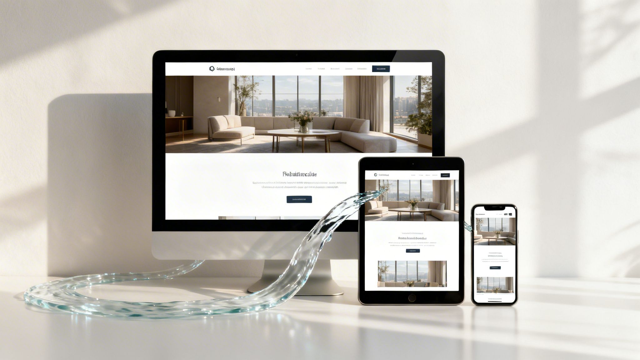
Imagine trying to pour the contents of a wide bucket into a narrow glass. You'd make a mess. A responsive website is built to be like water—it perfectly fills whatever container it’s in, whether that’s a desktop, a tablet, or a smartphone. That's the real core of it. We're not building multiple, separate websites. We’re crafting one single, intelligent site that adapts all on its own.
This goes way beyond just looking good. It’s about giving every potential customer a smooth, frustration-free experience, no matter how they find you. For UK businesses like a local construction firm or a wedding venue, where clients are often searching on the move, this is your first handshake. It’s what captures that initial interest and makes a great first impression.
The Core Principles of Responsiveness
So, how does a site actually adapt like this? A professional service builds your website using a few clever technical principles that work together to create that fluid, flexible feel.
- Flexible Grid Layout: Instead of a rigid, fixed design measured in pixels, a responsive site uses a fluid grid based on percentages. This means website elements can resize themselves based on the screen they're on, not a fixed number.
- Fluid Images and Media: Images and videos are also designed to scale up or down within their containers. This stops them from "breaking" the layout on a small phone screen or looking out of place, ensuring they always look sharp.
- Media Queries: This is the clever bit of code that acts like a sensor. It detects the screen size of the device being used and instantly applies the right style rules, rearranging the content to provide the best possible layout for that specific screen.
A responsive website isn't just a feature; it's the foundation of modern digital marketing. It ensures that every visitor, regardless of their device, receives the best possible version of your business, directly impacting their decision to engage or leave.
This adaptability is now absolutely essential. In the UK, where mobile connections are expected to hit 88.4 million by 2026, you can’t afford to ignore the mobile experience. The stats are brutal: 74% of UK users simply won't come back to a site if it isn't mobile-friendly, a fact that underlines why agencies like Bare Digital put a responsive website design service at the heart of what we do.
Ultimately, investing in a responsive design means you’re creating one cost-effective and future-proof digital storefront. It’s a direct investment in user satisfaction, search engine performance, and accessibility—all the crucial ingredients for real, sustainable growth.
Why Responsive Design Is Critical for UK Businesses
Let's be blunt: having a website that just sits there looking pretty on a desktop is no longer good enough. To win in today's market, your online presence has to work hard for you, and that starts with how it performs on the devices your customers actually use every single day.
For UK businesses, where the fight for local attention is tougher than ever, a responsive website isn't a "nice-to-have". It's a powerful commercial tool that directly affects your bottom line.
Think of it this way: your website is your 24/7 salesperson. If that salesperson is clumsy and frustrating to deal with on a mobile phone, potential customers are going to walk straight out the door and find a competitor. A site that isn't responsive actively creates friction, turning away good leads before they even see what you offer.
Supercharge Your Local SEO Rankings
Google has one main goal: give its users the best possible results. A huge part of that is making sure the sites it recommends work perfectly on whatever device the searcher is using—and most of the time, that’s a mobile phone. This is the whole idea behind mobile-first indexing.
In simple terms, Google now predominantly uses the mobile version of your website to figure out its quality and decide where to rank it. If your site offers a rubbish mobile experience—forcing people to pinch, zoom, and struggle to find what they need—Google notices. This can seriously torpedo your visibility, especially for those all-important local searches like 'plumber near me' or 'Cambridge wedding photographer'.
A professional responsive website design service ensures your site is built from the ground up to meet and exceed what Google wants to see. This sends a powerful signal to the search engine that your site provides a high-quality experience, which directly helps you rank higher in local search results and on Google Maps. If you're looking to boost your local visibility, you might find our guide to SEO services in Cambridge useful.
Elevate User Experience to Drive Conversions
A positive user experience is the bridge that turns a casual visitor into a paying customer. A responsive design makes sure that journey is smooth, intuitive, and completely seamless, whether someone's browsing on a desktop at home or on their phone during a lunch break.
Just think about these real-world scenarios for UK businesses:
- A potential client viewing a photographer's portfolio: On a responsive site, images load fast and look fantastic, letting them swipe through galleries effortlessly. On a clunky site, images get cut off or take an age to load, creating frustration and doubt.
- A family looking for information from a funeral home: During a difficult time, they need clarity and easy access above all else. A responsive site presents contact details and service info clearly, with phone numbers they can just tap to call. A non-responsive site just adds stress to an already awful situation.
- A homeowner searching for a local builder: They want to see project photos and read testimonials. A responsive design makes this simple, guiding them naturally towards a contact form that's easy to fill out on a small screen.
The commercial risk of a non-responsive site is clear and immediate. UK stats show that 73.1% of people will abandon a website if it isn't responsive, while a staggering 68% are more likely to engage with businesses that have a mobile-optimised site.
This shift in user behaviour makes responsive design the absolute cornerstone of online success. With top-ranking Google results now being overwhelmingly mobile-friendly, ignoring responsiveness means you are willingly handing business over to your competitors. You can find more web design statistics that really hammer home these trends.
Future-Proof Your Digital Presence
Finally, investing in responsive design is an investment in the future of your business online. Technology never stands still; new devices and screen sizes pop up every single year.
A responsive website is built on flexible principles, not for one specific device. This means it's already set up to adapt to future technologies, whether that’s a new type of foldable phone or a smart-screen device we haven't even thought of yet.
It saves you the immense cost and hassle of having to completely rebuild your site every few years just to keep up. It ensures your digital storefront stays effective, professional, and ready for business for years to come.
What to Expect From a Responsive Design Agency
Signing on for a responsive website design service can feel like a big commitment, but a good agency will make the whole process feel clear and collaborative, not mysterious. It’s not about handing over the keys and hoping for the best. Think of it as bringing expert navigators on board who have a clear map to get you where you need to go.
The entire project is broken down into distinct, logical phases. This way, nothing gets missed, you’re always in the loop, and the final website is perfectly tuned to your business goals. It's a proven process designed to get results for UK businesses just like yours.
Phase 1: Discovery and Strategy
Every great project starts with a proper conversation. This first phase is all about us getting to grips with your business, inside and out. It’s far more than a quick briefing; it’s a deep dive into your goals, your customers, your competitors, and what a real win looks like for you.
We'll ask the important questions to pin down the website's true purpose. Are you trying to drive more online bookings, get the phone ringing, or establish your brand as the go-to expert in your local area? The answers we uncover here will shape every single decision that follows.
During this stage, we’ll work together on:
- Project Goals and KPIs: Defining exactly what the website needs to achieve and how we’ll measure its success.
- Audience Personas: Building detailed profiles of your ideal customers so the design and content speak directly to them.
- Competitor Analysis: Looking at what your local rivals are doing right and, more importantly, where the opportunities are for you to do better.
- User Journey Mapping: Plotting the ideal paths visitors should take on your site to achieve a goal, like filling out a contact form or making a purchase.
This strategic groundwork is the most critical part of the whole project. Getting it right ensures we're all pulling in the same direction from day one.
Phase 2: UX and UI Design
With a solid strategy locked in, it’s time to start bringing your new website to life. This part is split into two closely related disciplines: User Experience (UX) and User Interface (UI). Think of it this way: UX is the logical flow that makes the site feel intuitive and easy to use, while UI is the look and feel—the colours, fonts, and visual polish that express your brand.
First, we create a wireframe. This is like an architect's blueprint for your website. It’s a simple, black-and-white layout of each page, showing the structure and where everything goes without any distracting design elements. It lets us focus purely on the user journey and content hierarchy.
Once you’ve approved the blueprint, the creative magic happens. We’ll build an interactive mock-up, which is a high-fidelity, clickable prototype of your site. This lets you see and feel exactly how the final website will work before a single line of code is written.
Phase 3: Development and Testing
This is where the approved designs get built into a real, functioning website. Our development team gets to work, building the site on a private staging server. This is a password-protected, behind-the-scenes version of your website where you can click around and test everything in a live environment, completely hidden from the public and search engines.
Rigorous testing is a non-negotiable part of any professional responsive website design service. We put the site through its paces, checking for:
- Cross-Browser Compatibility: Making sure the site works perfectly on Chrome, Safari, Firefox, and other popular browsers.
- Device Responsiveness: Testing on dozens of real devices—from the latest iPhones to Android tablets and wide-screen desktops—to guarantee a flawless experience on every screen size.
- Performance and Speed: Optimising images, scripts, and code to ensure your site loads lightning-fast, a crucial factor for both keeping visitors happy and ranking well on Google.
- Functionality: Checking every form, button, link, and feature to ensure it all works exactly as intended.
The process we follow focuses on a logical sequence of SEO, user experience, and forward-thinking design to drive genuine business growth.
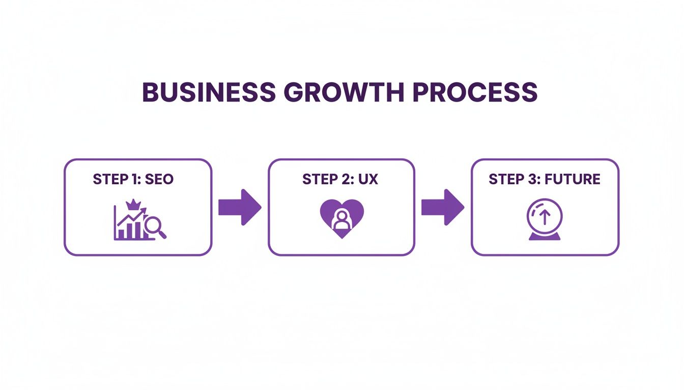
This structured flow isn't just a series of tasks; it’s a process that builds on itself to create a powerful, long-lasting asset for your business.
To help you understand what you should get at each stage, here's a quick breakdown of the typical deliverables in a professional responsive design project.
Core Deliverables in a Responsive Design Project
This table outlines the key assets and outcomes you should receive at each stage of a professional responsive website design project.
| Project Phase | Key Activities | What You Receive |
|---|---|---|
| Discovery & Strategy | Goal setting, audience research, competitor analysis, user journey mapping. | A detailed Project Brief, Audience Personas, and a clear Strategic Plan. |
| UX & UI Design | Wireframing, structural planning, visual design, prototyping. | A complete set of Wireframes and a clickable, high-fidelity Mock-up. |
| Development & Testing | Front-end and back-end coding, CMS integration, rigorous quality assurance. | Access to a private Staging Site for review and a comprehensive QA Report. |
| Launch & Optimisation | Site migration, final checks, performance monitoring, handover, training. | A fully live website, login credentials, training session, and ongoing Support Plan. |
Having this clear set of deliverables ensures there are no surprises and that you know exactly what to expect as your new website takes shape.
Phase 4: Launch and Optimisation
Once you’ve given the final green light, it’s go-live time. The agency will manage the entire technical launch, ensuring a seamless switchover with zero downtime for your visitors. But the journey doesn't stop the moment your site goes live.
A great partner sticks around to monitor the website’s performance, track the key metrics we defined back in phase one, and provide ongoing support. To start your own journey and see how this process could transform your business, feel free to get in touch with our team for a no-obligation chat. This final phase is about making sure your new website doesn't just launch beautifully, but continues to evolve and deliver a real, measurable return on your investment.
Understanding The Different Ways a Website Can Work On Mobile
When you start talking about getting a website to work on mobile, a bunch of terms get thrown around, and it can all get a bit confusing. But getting your head around the main options isn't just about learning tech jargon; it has real-world consequences for your budget, how much ongoing work is needed, and your search engine rankings.
Let’s cut through the noise and break down the choices. You’ll quickly see why a responsive website design service is the go-to standard for most UK businesses today.
Responsive Design: The All-in-One Solution
Responsive design uses a single, intelligent website that automatically changes its layout to look great on any screen it's viewed on. Think of it like water—it doesn't matter if you pour it into a tall glass or a wide bowl, it just fits perfectly. One website, one set of content, one URL. It simply flows to give the best possible experience, whether on a desktop, tablet, or phone.
This unified approach is precisely why Google themselves strongly recommend responsive design. It makes it far easier and more efficient for their crawlers to index your site, which gives you a major leg up in the SEO game. For your business, it means less faff and lower costs over the long run.
Adaptive Design: The Pre-set Outfits
Adaptive design takes a different route. Instead of one fluid layout, the website detects the device someone is using and loads one of several pre-built templates specifically made for that screen size—say, a desktop version, a tablet version, and a mobile one. It’s like having a wardrobe with a few different outfits for specific occasions.
While this can provide a highly tailored experience on those set screen sizes, it has some big downsides. It’s a lot more complicated and expensive to build and maintain all those separate layouts. Plus, what happens when a new phone with a funky screen size hits the market? You have to go back and build another new layout to support it.
Responsive design is forward-thinking; it works on the devices we have today and is ready for whatever comes next. Adaptive design is reactive, often needing expensive updates just to keep pace with new tech.
Mobile-Friendly and Separate Mobile Sites
"Mobile-friendly" is a much broader term. It just means a site is usable on a phone, but it doesn't say how. A responsive or adaptive site is mobile-friendly, but so is a separate "m-dot" site (like m.yourwebsite.co.uk).
This 'm-dot' method was one of the first attempts to solve the mobile problem, but it’s now seen as clunky and outdated. It means running two completely separate websites, which creates a whole mess of issues:
- SEO Nightmares: You end up with duplicate content problems and have to build authority (backlinks) for two different domains, effectively splitting your SEO power in half.
- Maintenance Headaches: Every single update, from changing a price to publishing a new blog post, has to be done twice. It’s inefficient and a recipe for errors.
- Clunky User Experience: Users often get sent to the wrong version of the site or get stuck on the mobile version even when they're on a desktop, which is just frustrating.
For businesses focused on growing their visibility, like many photographers, trying to juggle two separate sites just isn't a practical strategy. Our guide on SEO for photographers dives into how a single, unified online presence is vital for winning local clients.
Responsive vs Adaptive vs Mobile-Friendly Websites
To help you see the differences at a glance, here’s a quick comparison of how these common web design approaches stack up.
| Approach | How It Works | Best For |
|---|---|---|
| Responsive | One website with a fluid layout that adapts to any screen. | Almost all businesses; it's the modern standard for SEO and user experience. |
| Adaptive | Pre-built layouts are served based on detected device types. | Highly complex web applications where device-specific functionality is critical. |
| Mobile Site (m-dot) | A completely separate, second website built only for mobile. | An outdated approach that is rarely recommended due to high costs and SEO issues. |
When it comes down to it, choosing a responsive website design service isn't just a technical choice—it’s a smart business decision. It makes your marketing simpler, boosts your SEO, and guarantees every potential customer gets a brilliant first impression, setting you up for sustainable growth.
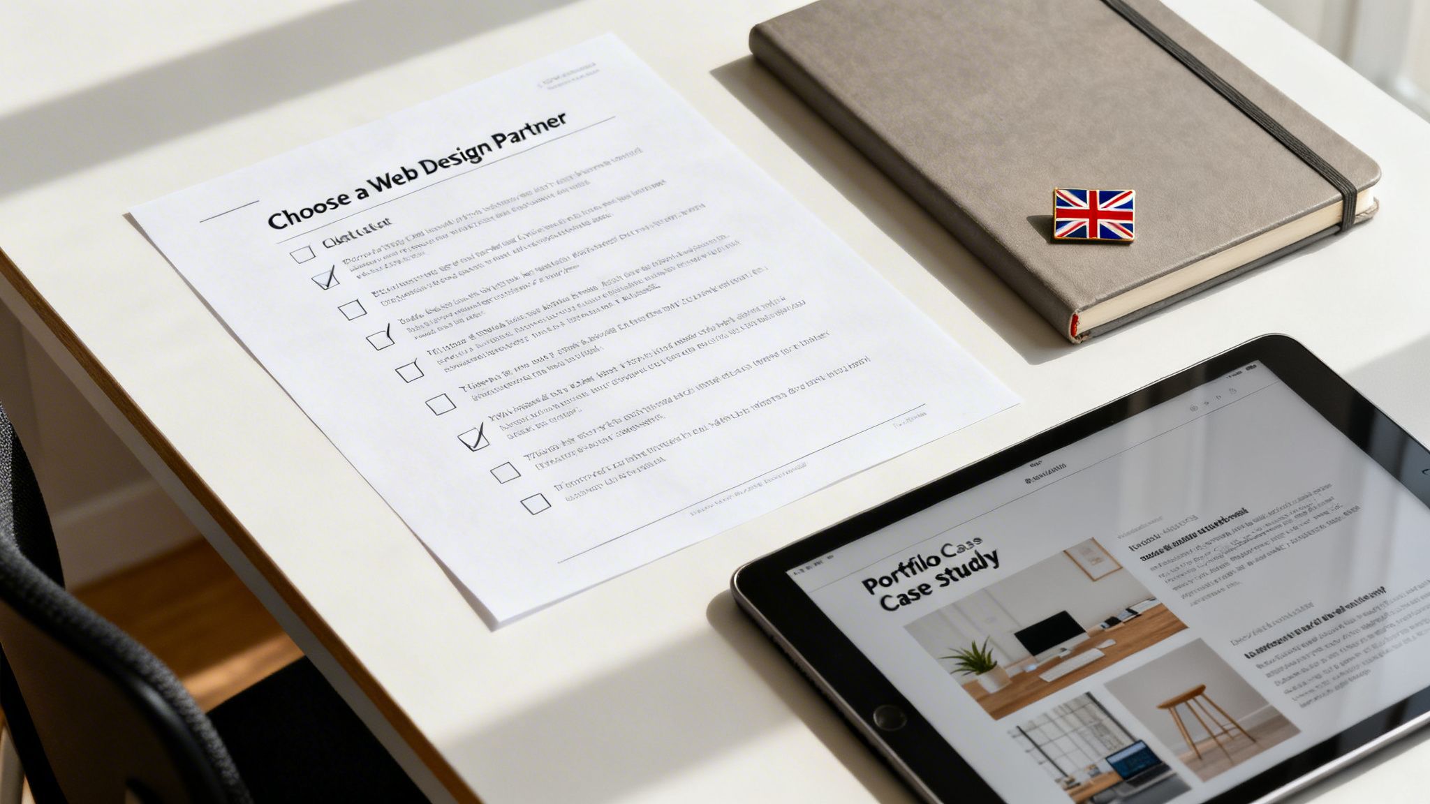
How to Choose the Right Web Design Partner in the UK
Picking the right agency for your responsive website design service is one of the biggest calls you'll make for your business. This isn’t just about getting a pretty website; it's about finding a partner who gets your commercial goals and knows how to turn your site into a machine for hitting them. The UK market is crowded, and a slick portfolio is only the beginning of the story.
A great partner doesn't just build the site and hand over the keys. They become an extension of your team, laser-focused on delivering results you can actually measure. To find that kind of partner, you need to dig deeper and vet them on the things that will genuinely grow your business.
Verify Their Expertise and Process
A top-tier agency won’t just talk about design; they’ll talk about strategy from the very first conversation. Their process should be transparent and logical, with a clear line of sight to your business goals right from the start. Look for a team that can walk you through their entire project journey, from discovery and strategy all the way to launch and ongoing optimisation.
You also need to check their technical chops. A common pitfall for agencies is becoming a "jack of all trades, master of none." They might offer services on every platform under the sun—WordPress, Shopify, Webflow, Squarespace—without being true specialists in any of them.
An agency that specialises in one or two platforms they know inside-out will be far more efficient and deliver a higher quality of work. They've developed the 'muscle memory' to navigate every intricacy, meaning a faster build for you and a more robust final product.
Going deep on one platform allows an agency to master its quirks, from custom coding possibilities to its specific SEO strengths. This specialisation is a sign of confidence and expertise, not a limitation. It means they know which tool is right for the job and how to execute it perfectly.
Review Relevant Case Studies and Results
A portfolio shows you what an agency can do visually, but case studies show you what they can achieve commercially. Don't just get wowed by beautiful designs; look for proof that their work has solved real business problems for businesses just like yours.
When you're looking at case studies, ask these critical questions:
- What was the original problem? Was the client struggling with low traffic, poor conversions, or a sky-high bounce rate?
- What was the solution? How did the agency's responsive design tackle these specific issues?
- What were the results? Look for hard numbers. Did leads increase by a specific percentage? Did they see a measurable lift in local search rankings?
A strong case study tells a story of transformation, and it's always backed by data. It proves the agency knows how to connect web design directly to business growth, especially within the competitive UK market.
Assess Their Communication and Reporting
How an agency communicates during the sales process is a huge clue to what they'll be like to work with. Are they responsive, clear, and attentive? Do they listen to your goals, or do they just try to push their own pre-packaged solutions?
A true partner puts clear and consistent communication first. They should set firm expectations for project timelines, feedback loops, and who your point of contact will be. Crucially, they must have a solid plan for reporting on performance after the site goes live.
Ask them how they measure success. A great agency will start talking about Key Performance Indicators (KPIs) like:
- Conversion rates on key pages
- Organic traffic growth from local search
- Bounce rate and user engagement metrics
- Rankings for important local keywords
Transparent reporting, ideally with access to a live dashboard, is the hallmark of a results-driven agency. It holds them accountable and gives you a clear, honest view of the return on your investment. Choosing the right responsive website design service is about finding a partner committed to your long-term success, not just a one-off project.
Turn Your Website into a Growth Engine
Throughout this guide, we’ve explored how a professional responsive website design service isn’t just a nice-to-have. In the UK market, it’s the very engine room of your business. Your website can no longer be a passive digital brochure; it has to be a hard-working tool for growth.
Think of it this way: a responsive site is the bedrock on which all your other marketing is built. Without it, any money you pour into local SEO, Google Ads, or social media campaigns will never see its full return. You're essentially trying to fill a leaky bucket, losing valuable leads and revenue to a poor user experience.
Your Next Step to Measurable Success
Getting your head around the importance of responsive design is the first step. The next is to take decisive action. It’s time to transform your online presence from a passive asset into an active, lead-generating machine. Waiting for customers to find you simply isn't a strategy. You need a website that actively draws them in, keeps them engaged, and turns them into customers.
To make this transition easy, we want to help you map out a clear plan. We can show you exactly where your website stands today and what it needs to become a powerful tool for your business's future. For more ideas on boosting your visibility right now, have a look at our comprehensive local SEO checklist to get started.
A great website doesn’t just represent your business—it actively grows it. By ensuring every visitor has a perfect experience, you turn your online visibility into tangible, measurable results like more enquiries, phone calls, and sales.
Don't let an outdated website hold your business back any longer. The path to transforming your online visibility starts with a single conversation.
It's time to stop wondering what's possible and start building a website that delivers real, sustainable growth. Book a no-obligation consultation with Bare Digital today. We’ll provide a free website health check and a bespoke activity plan, showing you the clear path forward to turning your online presence into your most valuable asset.
Frequently Asked Questions
Taking the plunge on a professional responsive website design service is a big decision, so it's only natural to have a few questions about the nuts and bolts of it all. To cut through the noise, we've rounded up the most common queries we hear from UK business owners, with straight, no-nonsense answers.
How Much Does a Responsive Website Cost?
This is a classic "how long is a piece of string?" question. The cost of building a responsive website can swing wildly, a bit like building a house. A straightforward, template-based site for a local tradesperson might start from around £2,000, while a fully bespoke, multi-page site with e-commerce and booking systems for a larger company could easily be £10,000 or more.
Ultimately, the final figure comes down to a few key things:
- Complexity: How many pages do you need, and what do you need them to do? Things like online shops or custom calculators will add to the cost.
- Design: Are we creating a unique design from the ground up, or customising a high-quality premium template?
- Content: How much writing and image sourcing is needed? Migrating content from an old site also takes time.
It’s vital to stop thinking of a website as a cost and start seeing it as an investment. The real focus should be on the return it generates through new leads and sales, not just the initial price tag.
How Long Does a Responsive Design Project Take?
For a typical responsive website project, you should expect it to take anywhere between 6 to 12 weeks. This covers everything from our first chat to the moment your new site goes live. A simple 'brochure' style website can often be turned around on the quicker end of that scale.
Of course, more complex jobs will take longer. If your project involves heavy customisation, complex software integrations, or creating a huge amount of new content, the timeline will naturally extend. Any decent agency will give you a detailed project plan with clear milestones, so you're never left wondering what's happening.
Do I Need to Provide My Own Content and Images?
It really depends on what works for you and your budget. Some business owners have a folder full of professional photos and perfectly written copy ready to go, which can certainly help keep the costs down.
However, most agencies, including us, offer full content creation and professional photography as part of the deal. The big advantage here is that you know the content will be written to convert and optimised for SEO right from the get-go. This is a critical piece of the puzzle and something that’s best to chat about during your initial consultation.
Ready to turn your website into a powerful growth engine for your UK business? Bare Digital offers bespoke responsive web design solutions that deliver measurable results. Explore our packages and book your free website health check today!

