Ecommerce conversion rate optimisation (CRO) is all about turning more of your website visitors into paying customers. It’s not about finding more traffic, but getting more value from the traffic you already have. This is done through smart, data-driven tweaks to your online shop's design, messaging, and overall user journey, removing any friction that stops people from buying.
What Is a Good UK Ecommerce Conversion Rate?
Before you start overhauling your site, it’s vital to know what you’re aiming for. Too many businesses get fixated on a mythical high conversion rate without understanding what’s realistic for the UK market. Knowing the benchmarks helps you set achievable goals and measure your progress properly.
A common pitfall is seeing a single-digit conversion rate and thinking you've failed. The truth is, even a small percentage can mean you’re doing very well. Context is king here—your industry, the price of your products, and where your traffic comes from all dramatically affect what a "good" rate looks like for you.
Understanding the Numbers
For most UK ecommerce businesses, the conversion rate won't be a huge number. Think of it as the small, valuable fraction of window shoppers who decide to buy something. Looking ahead to 2025, a healthy conversion rate for a UK ecommerce store sits somewhere between 2.5% and 3.5%. If you’re hitting 5% or more, you’re in the top tier of well-optimised sites.
These figures show that for every 100 visitors, convincing just two or three to make a purchase is a solid performance. If you want to dive deeper into these benchmarks, you can find more detail in this report on good ecommerce conversion rates.
The calculation itself is refreshingly simple:
(Total Number of Sales / Total Number of Visitors) x 100 = Conversion Rate %
So, if you had 500 visitors and made 15 sales last month, your conversion rate is a respectable 3%. This formula is the bedrock of any CRO effort.
This chart breaks down how different conversion rates stack up, and it also shines a light on a huge opportunity many businesses miss: mobile conversions.
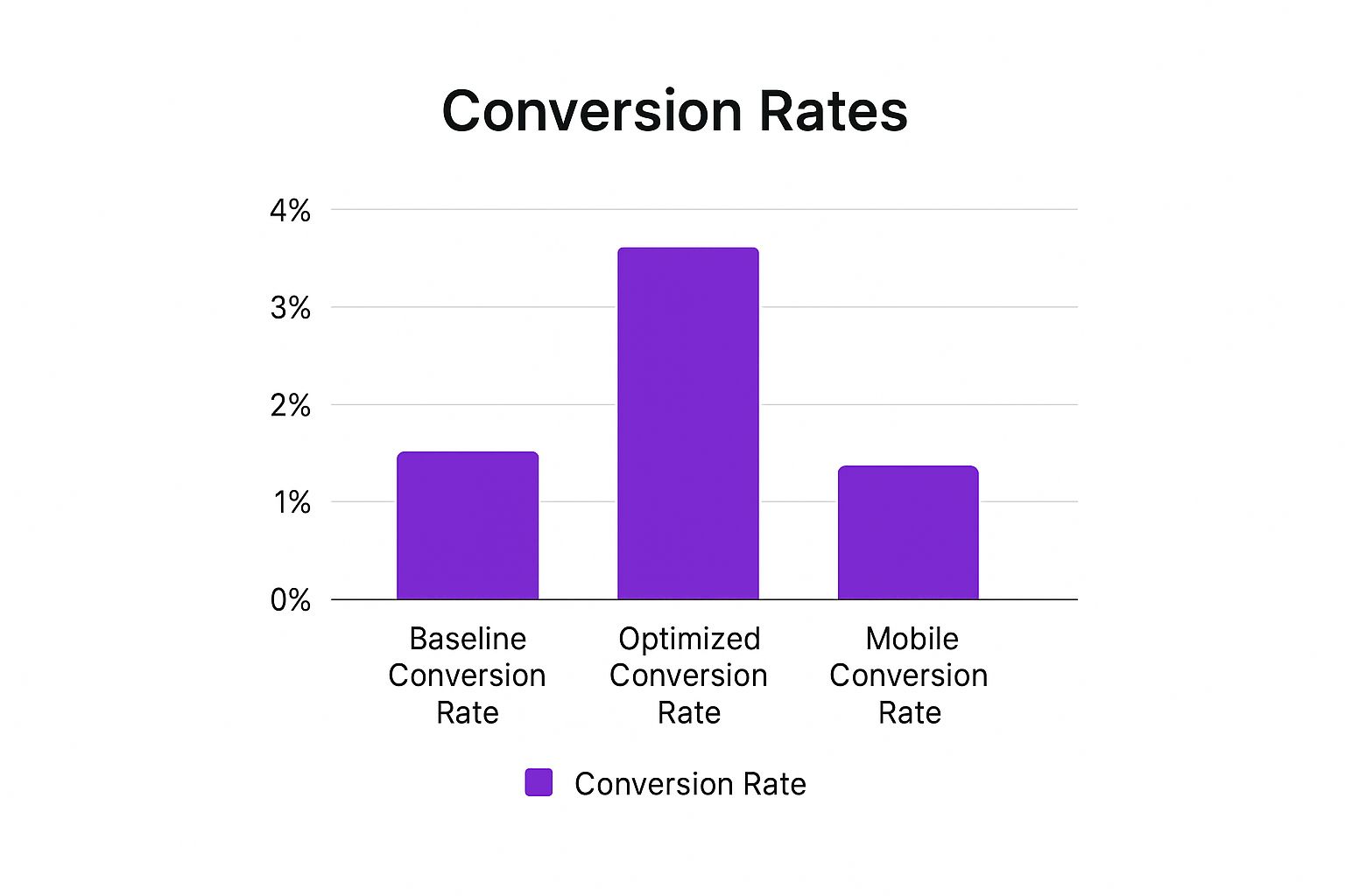
As you can see, a well-optimised site can easily double its baseline rate. But that glaring gap between desktop and mobile performance is often where the real potential for growth lies.
To put this into perspective, here's a quick look at what these numbers can mean in terms of real-world sales.
UK Ecommerce Conversion Rate Benchmarks at a Glance
This table gives a quick overview of what different conversion rate percentages mean for a typical UK ecommerce business.
| Conversion Rate | Performance Level | Typical Sales per 1,000 Visitors |
|---|---|---|
| Below 1% | Needs Improvement | Fewer than 10 |
| 1% – 2.5% | Average | 10 to 25 |
| 2.5% – 3.5% | Good (Industry Benchmark) | 25 to 35 |
| 3.5% – 5% | Excellent | 35 to 50 |
| Above 5% | Top Performer | 50+ |
These figures help translate abstract percentages into tangible outcomes, making it easier to see the impact of your CRO efforts.
Factors That Influence Your Rate
It’s so important to remember that benchmarks are just a starting point. A "good" conversion rate for a shop selling £5,000 bespoke furniture will look completely different from one selling £5 novelty socks.
Several factors will always pull your rate up or down:
- Industry and Product Type: High-ticket, considered purchases naturally have lower conversion rates than impulse buys or daily essentials.
- Traffic Source: A visitor from a targeted email promotion is usually much warmer and more likely to buy than someone clicking a broad social media ad.
- Device: As the chart showed, mobile conversion rates almost always lag behind desktop. A clunky mobile checkout can be a real killer for your overall performance.
- Brand Recognition: Big, trusted brands have an easier time converting because they've already earned their audience's credibility.
Ultimately, your real goal shouldn't be to hit some generic industry average. It should be to establish your own baseline and relentlessly work to improve it, month after month. Even a tiny 0.5% increase can lead to a massive lift in revenue over time.
Building Your Foundation for High Conversions

So many e-commerce brands make the same mistake: they jump straight into testing button colours and rewriting headlines. But effective conversion rate optimisation doesn’t start there. Treating CRO like a game of random A/B tests without a proper plan is like building a house with no foundations. You’re just setting yourself up for wasted time and skewed results.
The real work starts with a solid, data-led approach to understanding your website and the people who use it. It’s about ditching the guesswork and building a base of evidence that will inform every single optimisation decision you make.
This foundational stage is everything. It's where you find the hidden roadblocks, get to grips with what your users really want, and spot the biggest opportunities for growth. Skipping this is why so many CRO efforts fall flat.
Conduct a Thorough Website Audit
First things first, you need to give your website a proper health check. This isn’t just about spotting a few broken links. It’s a deep dive into every corner of the user experience that could be stopping visitors in their tracks.
Your goal here is to find and log every potential barrier preventing a visitor from becoming a customer. These "friction points" can be technical glitches or simple usability headaches, and they all add up.
Here's what you need to be looking at:
- Page Load Speed: How quickly do your key pages load, especially on mobile? A tiny 1-second delay in mobile load times can slash conversion rates by up to 20%. Use tools like Google PageSpeed Insights to see where you stand.
- Mobile Responsiveness: Is your site genuinely easy to use on a smartphone? With so much traffic coming from mobile, a clunky experience is an absolute conversion killer.
- Navigation and Site Structure: Can people actually find what they're looking for, easily? Confusing menus, vague categories, and a useless search bar are notorious for sending visitors bouncing right off your site. This is a big one for businesses moving online for the first time; you can find some great SEO tips for Cambridgeshire retailers and e-commerce startups that cover user-friendly site structure.
- Clarity of Calls-to-Action (CTAs): Are your "Buy Now" or "Add to Basket" buttons obvious and compelling? If your CTAs are vague or blend into the background, you’re leaving customers wondering what to do next.
Harness Data to Understand User Behaviour
Once you’ve got a handle on your site's technical health, it’s time to get into the data. Your analytics platform, whether it's Google Analytics 4 (GA4) or something else, is a treasure trove of insights into what your users are actually doing.
Forget vanity metrics like total sessions. You need to focus on the data that tells the story of the user journey and, crucially, where people are giving up. To create a solid base for growth, you need to implement actionable Shopify CRO strategies that are grounded in this kind of analysis.
By looking at user flow reports, you can see the exact paths people take through your site. This shows you the popular routes to purchase and, more importantly, highlights the pages where you’re losing droves of potential customers.
These drop-off points are where you need to start digging. For instance, if you see tons of people leaving from a specific product category page, it could mean anything from confusing product options and poor filtering to unexpected pricing.
Develop Authentic Customer Personas
Data tells you what people are doing, but it rarely tells you why. This is where customer personas come in. These aren't just fluffy, made-up profiles; they are detailed, semi-fictional characters representing your ideal customers, built from real data and research.
A genuinely useful persona should include:
- Demographics: Age, location, occupation.
- Goals: What are they trying to accomplish on your site?
- Pain Points: What problem are they hoping you can solve?
- Buying Triggers: What ultimately convinces them to make a purchase?
Creating these personas forces you to step into your customers' shoes. It helps you tweak your messaging, imagery, and the entire site experience to connect with their specific needs, making your optimisation efforts far more focused and effective.
How to Optimise Product Pages That Sell

Your product page is your final, most important sales pitch. It’s the digital equivalent of a shopper picking an item off a physical shelf, turning it over in their hands, and deciding whether it’s worth taking to the till. This is where you have to turn casual browsing into a firm decision to buy, making it a critical focus for any ecommerce CRO strategy.
Too many online shops make the mistake of treating product pages like simple spec sheets, just listing out features. A great page does so much more. It creates desire, answers questions before they’re even asked, and gives the customer enough confidence to hit ‘Add to Basket’. Nailing this means blending persuasive copy, fantastic visuals, and a healthy dose of social proof.
Forget generic advice. This is about creating a genuine experience that connects with your customer, guiding them smoothly towards that final click.
Write Product Descriptions That Truly Connect
Your descriptions need to do more than just describe—they need to sell an experience or a solution. Instead of just listing features, you need to translate them into real-world benefits for your customer. A feature is what your product is; a benefit is what your customer gets from it.
For example, don’t just say a coat has a "fleece-lined interior" (the feature). Explain that it "keeps you warm and cosy on frosty morning walks" (the benefit). That tiny shift in perspective makes all the difference.
To write descriptions that actually work, try this:
- Use your customer's language. Dig into your reviews and customer feedback to see the exact words and phrases they use.
- Tell a mini-story. Help the shopper picture themselves using the product in their own life.
- Keep it scannable. Use short paragraphs and bullet points to highlight the best bits for easy reading.
A well-crafted description gets ahead of your customer’s internal monologue, solving their problems before they've even had a chance to worry. It's a fundamental part of building trust. A page that feels rushed or unhelpful can also get penalised in search rankings, so being thorough is key. A full review, like the one in our technical SEO audit checklist, can help you spot content gaps that hurt both users and search engines.
Showcase Your Products With High-Impact Visuals
In ecommerce, your images and videos have to do all the heavy lifting. Customers can't touch or feel your products, so your visuals must bridge that sensory gap and build their confidence. This means investing in high-quality, professional photography is non-negotiable.
Show your products from every possible angle. Get some close-up shots to show off the details, textures, and quality. If it’s something you wear, show it on a model so people get a real sense of its scale and fit.
Pro Tip: Go beyond static photos. Product videos can boost conversion rates massively by showing the item in use, explaining its benefits, or just placing it in a real-world context. Even a simple 30-second clip can be far more persuasive than a dozen pictures.
To create a richer visual experience, consider adding:
- 360-degree views: Let users 'spin' the product around for a complete look from all sides.
- Lifestyle shots: Show the product in an aspirational setting to create an emotional connection.
- Size comparison images: Place the product next to a familiar object to give a clear idea of its actual size.
Build Trust With Authentic Social Proof
Here’s a simple truth: shoppers trust other shoppers far more than they trust brands. That’s the power of social proof, and it's one of the most effective tools for ecommerce conversion rate optimisation. Putting customer feedback right on your product pages can dissolve that last-minute purchase anxiety and make a customer feel great about their decision.
Customer reviews are the most obvious form of social proof. A simple way to get more is to send a follow-up email after a purchase. And don't be afraid to show both good and bad reviews—a perfect 5-star rating can sometimes feel less authentic than a more realistic 4.7-star average.
This really matters in certain sectors. In the UK, fashion has a tiny average conversion rate of just 1.9% and a cart abandonment rate over 70%. Compare that to electronics, which converts at a much healthier 3.6%. This tells us that building trust is absolutely vital in industries like fashion, where not being able to try something on creates hesitation.
Authentic user-generated content (UGC) is another goldmine. This includes photos and videos your customers share on social media. Sprinkling these onto your product pages shows real people enjoying your products, which is often way more relatable and convincing than polished marketing shots.
Right, let’s talk about the final, most crucial step in any online sale: the checkout.
You’ve done all the hard work. Your marketing was spot on, your product pages were persuasive, and the customer has added something to their basket. Now, don't fall at the last hurdle. A clunky, confusing, or untrustworthy checkout is the fastest way to lose a sale you’ve already won.
Think of it this way: this is where the money changes hands. Any friction here feels risky to the customer and can be devastating for your conversion rate. A seamless and speedy payment process isn't just a nice-to-have; it's a core part of your business. Getting it wrong means leaving revenue on the table, as nearly one in five UK shoppers admit to abandoning a purchase because the checkout was too long or complicated.
Single-Page vs Multi-Step Checkout
One of the first decisions you'll make is how to structure your checkout. Do you put everything on one page, or break it up into several steps?
Honestly, there’s no single right answer, and I’ve seen both work brilliantly.
-
Single-Page Checkout: This approach puts all the fields—delivery, billing, payment—on one screen. The big advantage is that it feels faster. Customers can see everything at once, which can be less intimidating than clicking through multiple pages. It’s a great fit for stores with lots of repeat customers whose details are saved, or for low-cost, impulse buys.
-
Multi-Step Checkout: Here, you break the process into logical chunks like 'Delivery', 'Payment', and 'Review', often with a progress bar at the top. This can feel less overwhelming, as customers only have to focus on one thing at a time. A huge bonus for you is that it makes it much easier to see where people are dropping off. If everyone bails on the payment step, you know exactly where to focus your optimisation efforts.
So, which is for you? If you sell high-value items, a more deliberate, multi-step process might build more confidence. For everything else, it’s worth testing both. Your analytics will tell you what your customers prefer.
Guest Checkout is Non-Negotiable
This one is simple. If you force new customers to create an account before they can buy from you, you are killing your conversion rate. Full stop.
First-time buyers aren’t ready for that kind of commitment. They just want to buy the thing and get on with their day. Making them create a password and sign up is a massive roadblock.
Always, always offer a guest checkout. It shows you respect your customer’s time and prioritises their convenience over your data-grabbing. You can always prompt them to create an account after the payment has gone through, using the details they’ve already entered. It’s a tiny change with a huge impact.
Streamline Forms and Offer Modern Payments
Every single field in your checkout form is a tiny piece of friction. The more you have, the more likely someone is to give up. It’s time to get ruthless.
Only Ask for What’s Essential
Go through your form field by field and ask yourself, "Do I absolutely need this to fulfil the order?"
- Ditch optional fields. Unless you’re strictly B2B, you probably don’t need a ‘Company Name’ field.
- Use an address lookup tool. Let customers enter their postcode and have the address populate automatically. It's faster and reduces errors.
- Consider combining ‘First Name’ and ‘Last Name’ into a single ‘Full Name’ field.
The goal here is to make the process feel effortless.
Embrace Popular Payment Gateways
You need to make it incredibly easy for people to give you their money. Limiting options to just credit and debit cards is an outdated approach.
Integrate the payment methods your customers actually use and trust:
- PayPal: It’s a household name. Millions of people have an account and can pay without having to dig out their wallet.
- Apple Pay & Google Pay: On mobile, these are game-changers. They allow for one-click payments, creating an experience that’s almost completely frictionless.
- Klarna or Clearpay: ‘Buy Now, Pay Later’ options are no longer a niche feature. They can significantly boost conversions, especially for bigger ticket items, by making the purchase feel more manageable.
Build Trust and Be Transparent About Costs
Finally, let’s talk about trust and transparency. Your customer is about to hand over sensitive financial details; they need to feel completely safe doing so.
Sprinkle trust signals throughout the checkout. These aren’t just decorative—they provide genuine reassurance.
- Display security badges from providers like McAfee or Norton.
- Show the logos of the payment methods you accept (Visa, Mastercard, PayPal).
- Make sure your returns policy is easy to find.
And for the biggest conversion killer of all: unexpected costs. There is nothing more infuriating for a customer than getting to the final step and seeing a surprise delivery fee added on. It feels sneaky, and it’s the number one reason for cart abandonment.
Be upfront about all costs—delivery, taxes, anything—as early as you can. Show it on the product page or in the shopping basket. Transparency builds trust and ensures there are no nasty shocks waiting at the end.
Using Data For Continuous Optimisation

Effective ecommerce conversion rate optimisation isn't a one-off project. It's not something you can just "do" and then tick off a list. The businesses I've seen achieve real, sustainable growth are the ones that treat it as an ongoing cycle of learning, testing, and improving.
It all comes down to adopting a data-first mindset. This means you stop relying on gut feelings and start basing every decision on what the numbers are telling you. The real goal is to build a culture of optimisation where every change is treated as an experiment designed to teach you more about your customers.
Demystifying A/B Testing
At the very core of this process is A/B testing, sometimes called split testing. The concept itself is beautifully simple. You create two versions of a single webpage—let's call them version A (the control) and version B (the variation)—and you show them to different segments of your audience to see which one performs better.
But to run a clean test that gives you genuinely useful information, you need a bit of structure.
- Start with a solid hypothesis. This is easily the most important step. A good hypothesis isn't a random guess; it's an educated statement backed by some form of data. For instance: "Changing our call-to-action button from 'Buy Now' to 'Add to Basket' will increase clicks by 15% because it feels less committal at this stage of the journey."
- Run a clean test. This is crucial. You must only change one element at a time. If you alter both the headline and the button colour, you'll have no idea which change actually caused the result.
- Wait for statistical significance. It’s tempting to call a test early when one version pulls ahead, but don't. You need enough data to be confident the result isn't just a random fluke. Most A/B testing tools will alert you when you hit this point, which is usually a confidence level of 95% or higher.
Uncovering The 'Why' Behind The Data
Quantitative data from your analytics and A/B tests tells you what is happening on your site. But to find the biggest breakthroughs, you need qualitative data to tell you why.
Imagine your analytics show a huge drop-off rate on your delivery options page. The numbers scream that there's a problem, but they don't explain what it is. This is where you bring in the qualitative tools.
- Heatmaps: These visual tools show you exactly where users are clicking, how they're moving their mouse, and how far they scroll down a page. You might spot people repeatedly clicking an element that isn't actually a link, which is a clear sign of frustration.
- Session Recordings: Watching anonymised recordings of real user sessions can be incredibly insightful. You might see someone struggling to find the delivery cost or getting confused by a confusing layout.
- Customer Surveys: Sometimes, the best way to get an answer is just to ask. Using specialised ecommerce survey software, you can ask pointed questions at the exact moment a customer might be feeling friction.
By combining these methods, you might discover the reason for the drop-off isn't the delivery cost itself, but the fact it's hidden until the very last second. That revelation gives you a powerful, evidence-based hypothesis for your next A/B test.
Prioritising Your Optimisation Efforts
With so many potential tests to run, it's easy to get overwhelmed. The key is to focus your energy where it will make the biggest difference.
Here’s where I always suggest starting:
- High-Traffic Pages: Even a tiny percentage improvement on your homepage or top-selling category pages can lead to a significant boost in sales.
- High Drop-Off Pages: Any page in your checkout funnel where you're losing a lot of people is a prime candidate for optimisation. Fixing these leaks can have an immediate impact.
- Low-Converting, High-Value Pages: Look for product pages that feature your most profitable items but have below-average conversion rates. A win here directly impacts your bottom line.
This continuous cycle of analysing, testing, and learning is the real engine behind long-term ecommerce growth. It's also important to remember that strong organic visibility plays a huge role; a steady stream of qualified traffic is the fuel for all your CRO efforts. Our guide on how to build backlinks can help strengthen your site’s authority and bring in that valuable traffic.
Common Ecommerce CRO Questions Answered
If you're just dipping your toes into conversion rate optimisation, you're bound to have some questions. Everyone does. Getting your head around the common hurdles with clear, practical answers is the secret to building a strategy that actually works. Think of this as your no-nonsense FAQ for making smarter decisions.
This isn't a 'set it and forget it' kind of deal. It's about constantly asking the right questions and using the data you find to sharpen your approach. Let's tackle some of the big ones that always seem to pop up.
How Long Does It Take to See Results From CRO?
This is the million-pound question, isn't it? The honest answer is: it depends. The time it takes to see real, measurable results from your CRO work boils down to two things: how big the change you made was, and how much traffic your website gets.
If you’ve got a high-traffic site, a small tweak—like changing the text on a call-to-action button—could give you statistically significant results in just a couple of weeks. But for bigger jobs, like a total overhaul of your product pages or checkout flow, you’ll probably need a month or more to gather enough reliable data. You simply need a large enough sample size to trust what you're seeing.
The real key here is patience. It's so tempting to call it a day after seeing an initial spike, but true ecommerce conversion rate optimisation relies on reaching statistical significance. This is how you know your results aren't just a fluke but a genuine shift in customer behaviour.
What Is More Important to Test: Small Tweaks or Big Changes?
Here's the thing: both have their place. A good CRO strategy uses both small, iterative tweaks and big, bold changes. It’s not about picking one over the other; it’s about knowing when to use each approach. I like to think of it as a 'revolution, then evolution' strategy.
Start with the big, sweeping changes—some call them radical redesigns—if you have a gut feeling that something is fundamentally broken with your user journey. For instance, if your checkout abandonment rate is through the roof, changing a button colour isn't going to move the needle. You might need to completely rethink the whole process to find a new, better-performing baseline.
Once you’ve established a solid foundation that you know works reasonably well, that’s when you switch to smaller, iterative tweaks. This is where you fine-tune what you've built. This could involve testing things like:
- Headline variations to see which message truly clicks with your audience.
- Call-to-action (CTA) colours to figure out which one grabs the most eyeballs.
- Image placements to find the most persuasive layout for your product pages.
This two-pronged approach lets you make massive leaps when you need to, followed by the steady, incremental gains that drive long-term growth.
Should I Focus on Desktop or Mobile Optimisation First?
Your own website analytics holds the answer. Let your data be your guide. Dive into your analytics platform and look at two crucial metrics: which device is driving the most traffic, and which one has the lowest conversion rate.
For most UK ecommerce stores right now, the pattern is crystal clear: mobile brings in the lion's share of traffic, but it often converts at a much lower rate than desktop. This gap is what we call the ‘mobile conversion gap’, and it’s almost always the single biggest opportunity for improvement.
So, the smart move is to prioritise optimising the experience where the biggest problem exists for the largest chunk of your users. While you should always aim to avoid common site-wide errors, focusing your energy on the mobile experience first is where you'll likely see the most significant returns. Overlooking this is one of the classic SEO mistakes that small businesses make, as a clunky mobile experience can tank both your conversions and your search rankings.
Ready to turn more visitors into customers? Bare Digital offers a free SEO Health Check to identify your biggest conversion opportunities. Get your custom proposal today and start building a high-performing ecommerce site.