

In a world where smartphones are the primary gateway to the internet, neglecting mobile search engine optimisation is like building a shop with no front door. The majority of your potential customers are searching, browsing, and buying from their mobile devices, and Google has organised its entire ranking system around this reality. This is why mobile-first indexing isn't just a passing trend; it's the standard. A poor mobile experience doesn't just frustrate users and send them to competitors, it actively harms your search rankings and business visibility.
This guide moves beyond generic advice to provide a comprehensive roundup of actionable mobile SEO best practices. We will break down the crucial strategies your business needs to implement for sustained success, from technical foundations to user-centric design. You will learn precisely how to implement responsive design, slash page load times, and structure your content for mobile-first indexing. Furthermore, we'll cover optimising for local 'near me' searches, ensuring a touch-friendly interface, and leveraging structured data to enhance your mobile search appearance.
Mastering these elements is essential for digital success in today's competitive market, especially for businesses in Cambridgeshire and across the UK seeking to connect with their local audience. This listicle is designed to be a practical toolkit, providing the specific steps needed to improve your mobile performance, attract more customers, and drive meaningful growth.
1. Responsive Web Design
Responsive web design stands as the cornerstone of any effective mobile SEO strategy. Popularised by Ethan Marcotte and officially recommended by Google since 2015, this approach ensures your website provides an optimal user experience across all devices, from large desktop monitors to the smallest smartphone screens. It works by using a single HTML codebase and the same URL for all versions of your site. CSS media queries then intelligently adapt the layout, presentation, and content hierarchy to fit the user's screen size.
This unified approach eliminates the need for separate mobile (m-dot) websites, simplifying website management and consolidating link equity. A single, responsive site is easier for Google to crawl, index, and organise, which is a significant factor in modern mobile SEO best practices. Major brands like Starbucks and the BBC have long utilised responsive design to deliver a seamless, consistent brand experience to millions of users on any device.

How to Implement Responsive Design Correctly
To successfully implement responsive design, focus on flexibility and the user's context. A mobile-first methodology, championed by experts like Luke Wroblewski, is crucial. This involves designing the simplest version of your site for small screens first and then progressively enhancing the layout for larger screens.
Here are actionable tips for a robust responsive implementation:
- Use the Viewport Meta Tag: Always include
<meta name="viewport" content="width=device-width, initial-scale=1.0">in the<head>of your HTML. This tag tells the browser how to control the page's dimensions and scaling, ensuring it renders correctly on mobile devices. - Embrace Flexible Layouts: Utilise modern CSS techniques like Flexbox and CSS Grid. These tools allow you to create fluid layouts that automatically adjust element positioning and size based on available screen space, far surpassing older, more rigid methods.
- Make Images and Media Fluid: Prevent images from breaking your layout on small screens by applying
max-width: 100%;andheight: auto;in your CSS. This ensures images scale down proportionally to fit their container. - Prioritise Touch Targets: Design for fingertips, not mouse cursors. Ensure buttons, links, and other interactive elements are large enough to be tapped easily. Google recommends a minimum size of 48×48 pixels for touch targets to avoid user frustration.
2. Mobile Page Speed Optimisation
Mobile page speed optimisation is a critical component of modern SEO, focusing on decreasing the time it takes for a webpage to load on mobile devices. Popularised by performance experts like Steve Souders and Ilya Grigorik and cemented by Google's decision to use it as a ranking factor, speed is paramount. Mobile users often contend with less stable connections and less powerful hardware, making a fast, lightweight experience essential for retaining their attention and reducing bounce rates.
This dedicated focus on performance involves a technical approach to minimising file sizes, optimising server response times, and carefully managing how resources are loaded. The goal is to deliver the core content to the user as quickly as possible, ideally in under 3 seconds. E-commerce giant AliExpress saw a 10.5% increase in orders after reducing load time by 36%, proving that speed is directly tied to revenue and a core pillar of mobile SEO best practices.

How to Implement Mobile Page Speed Optimisation
Achieving a fast mobile site requires a multi-faceted strategy that addresses everything from image files to server configurations. The focus should be on delivering a superior user experience by making the site feel instantaneous and responsive, particularly on slower networks.
Here are actionable tips for robust page speed optimisation:
- Target Core Web Vitals: Aim for a Largest Contentful Paint (LCP) of under 2.5 seconds. This Google metric measures when the main content of the page is likely to have loaded, providing a clear benchmark for user-perceived load speed.
- Compress and Optimise Images: Use modern image formats like WebP, which can offer 25-35% smaller file sizes than traditional JPEG or PNG formats without losing quality. Also, implement lazy loading for images that are below the fold, so they only load when a user scrolls to them.
- Minimise and Defer Scripts: Reduce JavaScript execution time by minifying code and removing unused scripts. Use the
asyncordeferattributes on script tags to prevent them from blocking the initial rendering of the page. - Enable Server-Side Compression: Use GZIP or Brotli compression on your server to significantly reduce the size of your HTML, CSS, and JavaScript files before they are sent to the browser. This simple change can dramatically improve load times.
3. Mobile-First Indexing Optimisation
Mobile-first indexing represents a fundamental shift in how Google understands and ranks websites. Popularised by Google officials like Gary Illyes and John Mueller, and fully rolled out by 2021, this approach means Google predominantly uses the mobile version of your content for indexing and ranking. It no longer crawls a desktop site and then adapts its understanding for mobile; the mobile experience is the baseline.
This change requires a complete re-evaluation of your website's structure, forcing content parity between desktop and mobile versions. Any content, structured data, or metadata hidden or missing from the mobile view is effectively invisible to Google's primary crawler. Brands like Amazon and Wikipedia have excelled in this area, ensuring that every piece of product information or encyclopaedic knowledge is equally accessible on any device, making this a critical component of modern mobile SEO best practices.
How to Optimise for Mobile-First Indexing
To succeed with mobile-first indexing, your primary goal is to achieve complete content and feature parity between your mobile and desktop sites. The mobile version is not a "lite" version; it is the version of your site as far as Google is concerned. Adopting a responsive design is the most straightforward way to avoid discrepancies.
Here are actionable tips for robust mobile-first optimisation:
- Ensure Content Parity: Crucial text, images, and videos must be present on both versions. Avoid hiding important content behind user actions like clicks or tabs on mobile, as Google may devalue it.
- Verify Structured Data: Check that the same structured data markup (like Schema.org for products, reviews, or events) exists on your mobile pages as it does on your desktop pages. Use Google's Rich Results Test on your mobile URLs to confirm.
- Check Meta Tags: Your meta titles, descriptions, and other header tags must be identical across both versions. Discrepancies can confuse crawlers and negatively impact rankings.
- Test and Monitor: Regularly use Google's Mobile-Friendly Test to identify usability issues. Within Google Search Console, check your site's mobile-first indexing status and monitor the "Mobile Usability" report for errors. For a deeper dive, you can learn more about Mobile-First Indexing Optimisation on bare-digital.com.
4. Touch-Friendly Interface Design
A touch-friendly interface is crucial for mobile success, addressing the fundamental difference between navigating with a precise mouse cursor and a much broader fingertip. Popularised by mobile pioneers like Apple through its Human Interface Guidelines and Google with its Material Design principles, this approach focuses on making all interactive elements large enough and spaced far enough apart to be tapped accurately and without frustration. A poor touch experience can lead to high bounce rates and abandoned carts, directly signalling to search engines that your site offers a subpar user experience.
Ensuring your site is easy to use with a thumb is a core component of modern mobile SEO best practices. Major e-commerce platforms like Booking.com have famously increased mobile conversions simply by optimising the size and placement of their call-to-action buttons. This design philosophy goes beyond aesthetics; it's about accessibility and functionality, ensuring users can achieve their goals on your site effortlessly, which is a powerful positive signal for SEO.

How to Implement a Touch-Friendly Interface
Creating a touch-friendly design requires a deliberate focus on size, spacing, and user behaviour. The goal is to eliminate "rage taps" and accidental clicks, providing a smooth and intuitive journey for every mobile visitor.
Here are actionable tips for a robust touch-friendly implementation:
- Mind the Touch Target Size: Make all clickable elements at least 48×48 pixels. This is Google's recommended minimum size, ensuring that buttons, links, and form inputs can be tapped reliably without needing to zoom in.
- Consider the "Thumb Zone": As researched by mobile UX expert Luke Wroblewski, place primary navigation and key action buttons within the area easily reached by a user's thumb, typically the bottom and centre of the screen.
- Provide Ample Spacing: Ensure there is enough space between interactive elements to prevent accidental taps. A minimum of 8-10 pixels of padding around each touch target is a good starting point.
- Optimise Form Fields: Design forms for mobile by making input fields full-width. This makes them easier to tap into and type. Also, ensure your font size for body text is at least 16px to maintain readability.
5. Structured Data Implementation for Mobile
Structured data is a standardised format for providing information about a page and classifying its content. By implementing schema markup on your mobile pages, you give search engines explicit clues about the meaning of your content, which enables them to display it in rich, eye-catching formats in search results. Mobile search results frequently feature enhanced listings like recipe cards, product ratings, and FAQ accordions, which are powered by this data.
Properly implemented structured data is a critical component of modern mobile SEO best practices. Because rich results occupy more screen real estate on smaller devices, they are significantly more prominent and valuable than on desktop. This increased visibility can dramatically boost click-through rates. Brands like AllRecipes leverage Recipe schema to dominate food-related searches with rich cards, while Eventbrite uses Event schema for highly visible mobile event listings, demonstrating the power of this technique.
How to Implement Structured Data Correctly
To implement structured data effectively, focus on accuracy and relevance. The goal is to precisely describe your page's content to search engines, helping them understand it better and reward it with enhanced visibility. This is not about tricking the algorithm but about providing clarity. Understanding the importance of this markup is the first step, and you can learn more about why schema markup is important for SEO on bare-digital.com.
Here are actionable tips for a robust structured data implementation:
- Use JSON-LD: Implement schema using the JSON-LD (JavaScript Object Notation for Linked Data) format. Google recommends this method as it is easier to implement and maintain without intermingling with your visible HTML content. Simply place the script tag within the
<head>or<body>of your page. - Test and Validate: Before and after deployment, always test your markup using Google's Rich Results Test tool. This tool will confirm if your page is eligible for rich results and highlight any errors or warnings that need to be addressed.
- Prioritise Relevant Schema: Focus on implementing schema types that directly match your content and have known rich result features on mobile. For example, use
Productschema for e-commerce pages,LocalBusinessfor service pages, andArticlefor blog posts. - Monitor Performance: Keep a close eye on the Rich Results reports in Google Search Console. These reports show which rich results Google has found on your site, how they are performing, and if any issues have arisen that need your attention.
6. Mobile Content Optimisation
Mobile content optimisation involves strategically adapting your content's structure, format, and delivery for users on smartphones and tablets. This goes beyond just making text fit a smaller screen; it acknowledges that mobile users have different consumption patterns, often engaging in short bursts or "micro-moments" while on the go. Pioneered by usability experts like Jakob Nielsen who emphasised scannable content, this approach prioritises immediate value and readability.
The core principle is to make information highly digestible. Unlike desktop users who may be prepared for in-depth reading, mobile users need to find answers quickly. This makes content structure a critical component of mobile SEO best practices. Major platforms like CNN and BuzzFeed excel at this, using short paragraphs, impactful headings, and engaging visuals to deliver information efficiently, ensuring users get what they need without friction or frustration.
How to Implement Mobile Content Optimisation
To optimise content for mobile, you must prioritise clarity and scannability. Think about the user's context: are they looking for a quick fact, a phone number, or directions? Structure your content to serve these immediate needs first, placing the most crucial information at the very top of the page.
Here are actionable tips for effective mobile content optimisation:
- Prioritise Readability: Use a font size of at least 16px to ensure text is legible without pinching to zoom, which can be a poor user experience. Maintain a line height of around 1.5-1.6 to give text room to breathe and improve comprehension.
- Structure for Scannability: Break up long walls of text. Use short paragraphs (2-3 sentences), clear H3 and H4 headings, bullet points, and numbered lists to organise information into logical, digestible chunks.
- Keep It Concise: Place your most important message or the answer to the user's query within the first two paragraphs. Mobile users are less likely to scroll extensively to find what they are looking for.
- Optimise Interactive Elements: Make phone numbers clickable using
tel:links and ensure embedded maps are interactive. This removes barriers for users trying to contact your business or find your location. - Use Expandable Sections: For longer-form content that is still valuable, use accordions or "read more" toggles. This allows you to present a clean, concise overview while giving users the option to delve deeper into specific sections if they choose.
7. Mobile Technical SEO Fundamentals
Mobile technical SEO fundamentals encompass the backend elements that ensure search engines can properly crawl, index, and rank your mobile site. Unlike on-page content or design, this practice focuses on the technical infrastructure, ensuring a flawless dialogue between your website and search engine crawlers. A technically sound mobile site prevents indexing problems and unlocks your content's full ranking potential.
This discipline is crucial for a robust mobile strategy, as even the best content can be invisible to Google if technical barriers exist. It involves precise configuration of server settings, site architecture, and code to support both mobile users and crawlers. For example, Wikipedia expertly uses rel="alternate" and rel="canonical" tags to connect its separate mobile (m.wikipedia.org) and desktop versions, consolidating authority. Similarly, The Guardian’s implementation of Accelerated Mobile Pages (AMP) for news articles led to significant mobile traffic growth by addressing technical speed requirements, making it a key component of mobile SEO best practices.
How to Implement Mobile Technical SEO Correctly
A successful implementation starts with a comprehensive audit to identify and resolve mobile-specific technical issues. This proactive approach ensures your site is accessible, indexable, and provides a clean foundation for all other SEO efforts. For businesses looking for specialised support, exploring expert technical SEO services can provide a strategic advantage.
Here are actionable tips for a robust technical setup:
- Prioritise the Viewport Meta Tag: Always include
<meta name="viewport" content="width=device-width, initial-scale=1.0">in your HTML<head>. This is a non-negotiable instruction for browsers to render your page correctly on mobile screens. - Do Not Block Resources: Ensure your
robots.txtfile does not block search engine crawlers from accessing crucial CSS, JavaScript, or image files. Crawlers need these resources to render and understand your page fully. - Manage Mobile Configurations: If you use a separate mobile URL (m-dot), correctly implement
rel="alternate"on the desktop page andrel="canonical"on the mobile page pointing back to its desktop equivalent to prevent duplicate content issues. - Avoid Intrusive Interstitials: Google penalises sites that use pop-ups or other interstitials that cover the main content immediately after a user navigates to a page from search results, as they create a poor user experience.
8. Mobile Local SEO Optimisation
Mobile local SEO optimisation is the practice of tailoring your digital presence to capture mobile users searching with local intent. With research indicating that 76% of people who search for something nearby on their smartphone visit a related business within a day, this is a critical component of any comprehensive SEO strategy. Mobile users seeking local businesses typically have high purchase intent and require immediate information, such as your location, opening hours, and contact details.
This targeted approach ensures your business appears prominently in Google's Local Pack and on Maps for relevant "near me" searches. It goes beyond general SEO by focusing on geographical signals and providing instant, actionable information. For example, a local coffee shop using Google Business Posts to promote daily specials can attract nearby mobile users, while an auto repair shop leveraging click-to-call functionality makes it effortless for a stranded motorist to get in touch. This focus on immediate local needs is one of the most effective mobile SEO best practices for driving foot traffic and generating leads.
How to Implement Mobile Local SEO Correctly
Successful mobile local SEO hinges on accuracy, accessibility, and authority within your specific geographic area. It involves making it as easy as possible for both users and search engines to find and understand your business's location-specific information.
Here are actionable tips for a robust mobile local SEO implementation:
- Claim and Verify Your Google Business Profile: This is the foundation of local SEO. Ensure every section is fully completed with accurate information, high-quality photos, and consistent NAP (Name, Address, Phone Number) details.
- Implement Local Schema Markup: Add
LocalBusinessstructured data to your website. Include crucial details like your address, opening hours, and geo-coordinates to help search engines understand and display your location information accurately in search results. - Optimise for 'Near Me' Searches: Naturally incorporate location-specific keywords and phrases like "[service] near me" or "[product] in [city/town]" into your mobile site's content, title tags, and meta descriptions.
- Prioritise Click-to-Call Functionality: Make your phone number a clickable link using
<a href="tel:+441223XXXXXX">Call Us Now</a>. This simple step removes a key barrier for mobile users who want to contact you immediately. Utilising some of the best local SEO tools in 2023 from bare-digital.com can help track and manage these local signals effectively.
9. Optimise for Local Search
Optimising for local search is a non-negotiable component of a robust mobile SEO strategy, particularly for businesses with a physical presence. When users search for products or services "near me," search engines like Google prioritise results from the Local Pack, which displays a map and listings of nearby businesses. A well-optimised local presence ensures your business appears in these high-visibility results, directly connecting you with customers who have a strong intent to visit or purchase.
This approach involves more than just having a website; it’s about making your business discoverable at the precise moment a local customer needs you. For businesses in Cambridgeshire, from a coffee shop in Cambridge centre to a plumber in Peterborough, this is a critical driver of footfall and revenue. Proper local optimisation is a cornerstone of modern mobile SEO best practices, bridging the gap between online searches and offline sales.
The following infographic highlights just how strong the connection is between mobile searches and real-world commercial activity.
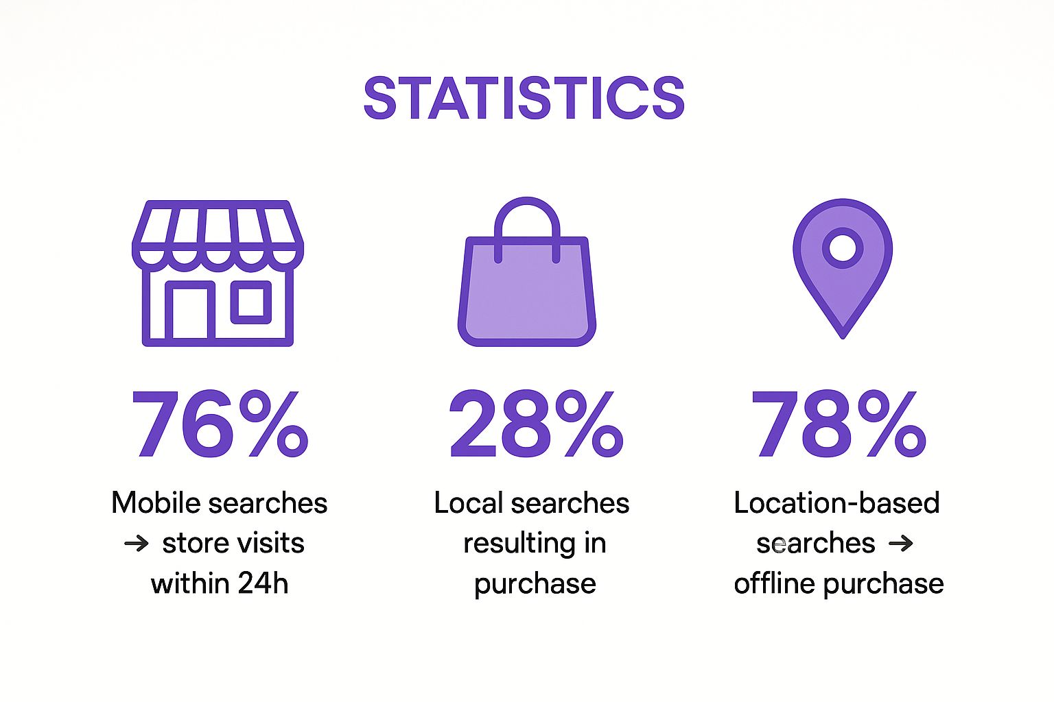
These figures demonstrate the powerful commercial intent behind local mobile searches, with the vast majority leading directly to offline purchasing decisions.
How to Implement Local SEO Correctly
To effectively capture local mobile traffic, your optimisation efforts must be consistent, accurate, and comprehensive. This means ensuring your business information is uniform across the web and that your online presence is rich with local signals.
Here are actionable tips for a strong local mobile SEO implementation:
- Claim and Optimise Your Google Business Profile: Your Google Business Profile (GBP) is your most valuable local SEO asset. Fully complete every section: add your business name, address, phone number (NAP), opening hours, categories, services, photos, and posts. Encourage customer reviews, as they significantly influence rankings.
- Ensure NAP Consistency: Your business name, address, and phone number (NAP) must be identical across your website, GBP, and all other online directories and citations (e.g., Yell, Thomson Local). Inconsistencies can confuse search engines and harm your local ranking.
- Create Localised Content: Develop content that is relevant to your local audience. This could include blog posts about local events, landing pages for specific towns or neighbourhoods you serve, or case studies featuring local clients. Mentioning local landmarks or areas helps search engines associate your business with that location.
- Build Local Citations and Links: A citation is any online mention of your NAP. Actively build citations in reputable local and industry-specific directories. Additionally, earn backlinks from other local businesses, news sites, or community organisations to strengthen your local authority.
Mobile SEO Best Practices Comparison
| Item | Implementation Complexity | Resource Requirements | Expected Outcomes | Ideal Use Cases | Key Advantages |
|---|---|---|---|---|---|
| Responsive Web Design | Moderate to High | Web development time, testing tools | Consistent UX across devices, SEO-friendly single URL | Websites needing unified user experience | Google's preferred, easy maintenance, link equity |
| Mobile Page Speed Optimisation | High | Technical expertise, monitoring tools, hosting/CDN | Faster load times, improved rankings, higher conversions | Sites requiring improved mobile performance | Better UX, reduces bounce, boosts SEO rankings |
| Mobile-First Indexing Optimisation | Moderate | SEO audits, content updates | Proper indexing and ranking based on mobile content | Sites with separate content versions | Aligns SEO with mobile user behaviour |
| Touch-Friendly Interface Design | Low to Moderate | UI/UX design resources | Improved usability, reduced errors, higher conversions | Mobile apps, interactive mobile websites | Enhances accessibility, reduces accidental clicks |
| Structured Data Implementation for Mobile | Moderate to High | Technical SEO expertise | Enhanced search result features, higher CTR | E-commerce, recipe sites, local businesses | Boosts visibility with rich results |
| Mobile Content Optimisation | Low to Moderate | Content creators, editors | Better engagement and readability on mobile | Content-heavy sites targeting mobile users | Improves readability, reduces bounce rates |
| Mobile Technical SEO Fundamentals | High | Technical SEO knowledge, tooling | Proper crawling, indexing, ranking on mobile | Complex sites, multi-device targeting | Prevents errors, improves crawl efficiency |
| Mobile Local SEO Optimisation | Moderate | Local listing management, content | Increased local mobile traffic, foot traffic | Multi-location businesses, local service providers | Captures high-intent local searches, competitive |
Bringing It All Together for Mobile Dominance
Navigating the landscape of mobile SEO can seem like a complex journey, but as we've explored, it boils down to a core principle: putting the mobile user first. The days of treating mobile as an afterthought are long gone. Today, a robust mobile strategy is the very foundation of digital success, directly impacting your visibility, user engagement, and ultimately, your bottom line. We've journeyed through the essential pillars, from the non-negotiable requirement of responsive web design to the critical need for blazing-fast page speeds. Each practice is a crucial piece of a larger puzzle.
Realising the full potential of your online presence means embracing a holistic approach. It’s not enough to simply have a website that shrinks to fit a smaller screen. You must meticulously craft an experience that is intuitive, efficient, and valuable for users on the go. This involves optimising for mobile-first indexing by ensuring Googlebot sees the same rich content on mobile as it does on desktop, and designing a touch-friendly interface that eliminates user frustration with accessible buttons and ample spacing. These are fundamental mobile SEO best practices that search engines now expect as standard.
Key Takeaways for Your Mobile Strategy
To crystallise the key actions, let's recap the most impactful takeaways from our discussion. Your immediate focus should be on creating a seamless and technically sound mobile experience.
- Prioritise Performance: Your site's loading time is a make-or-break factor. Compressing images, leveraging browser caching, and minimising code are not just technical tweaks; they are essential user experience enhancements that Google rewards.
- Structure for Success: Implementing structured data is your secret weapon for gaining enhanced visibility in mobile SERPs. Rich snippets, FAQs, and local business schema can dramatically increase your click-through rates.
- Content is Still King, but Context is Queen: Your content must be adapted for the mobile context. This means shorter paragraphs, compelling headlines, and ensuring your most important information is immediately accessible without excessive scrolling or pinching.
- Think Local, Win Big: For businesses in Cambridgeshire and beyond, mobile local SEO is paramount. Optimising your Google Business Profile and building local citations connects you directly with customers actively searching for your services nearby.
Your Actionable Next Steps
Mastering these mobile SEO best practices is an ongoing commitment, not a one-time project. Start by performing a comprehensive audit of your current mobile site. Use tools like Google's PageSpeed Insights and its Mobile-Friendly Test to identify immediate areas for improvement. Create a prioritised list of actions, starting with the highest-impact, lowest-effort tasks.
Remember, the goal is to create a virtuous cycle. A better mobile experience leads to higher engagement, which signals to Google that your site is a valuable resource. This, in turn, boosts your rankings, driving more mobile traffic and giving you more data to further refine your strategy. By consistently applying these principles, you are not just ticking SEO boxes; you are building a powerful digital asset that serves your customers and drives sustainable growth for your business in an increasingly mobile-centric world.
Feeling overwhelmed by the technical details? At Bare Digital, a specialist SEO agency based in Cambridgeshire, we translate these complex mobile SEO best practices into a clear, actionable strategy tailored for your business. Let us handle the complexities so you can focus on what you do best.